Why it in a film industry's best interests to create a brand.?
what is a brand?
A brand is a type of product manufactured by a particular company with a particular name.
These companies manufacture merchandise which they sell. They sell hard copies of the actual movies. They have music tracks they use. The cast used are important. All of these are how the business or industry make their profit.
An example would be the film Frozen. They now have lunchboxes and bags and stationary with their movie on it which gets them more profit.
We must understand that branding is changing and evolving. Before, we had a camera, gps, music stereo, phone, internet. This has all come together in a process call technological convergence.
Technological convergence: The coming together of other media technologies.
in 1996, The web 1.0 was created. It was called the "the mostly read-only web". It had 250,000 sites with around 45 million global users. The published content was a lot more than the user generated content. 10 years later, 2006, The web 2.0 was made. Now called "the wildly read-write web" With over
1 billion users globally. The user generated content a lot higher than published content.
This shows that people are consuming things from producers and are making memes and pictures on them and are responding to them which makes them prosumers as they consume and then produce their own content.
Web 2.0
A
term coined in 2004 to describe the second generation of web base communities
such as social networking sites, wikis etc.
WE now come to a theorist named Henry Jenkins. He came up with the convergence theory.
Jenkins explored the roles of fans. He believed that fans are people who consume ideas and then produce their own from what they consumed. (prosumers) He came up with the idea that the reason why technology is rapidly advancing is primarily due to the fact that consumers are wanting more and more and are suggesting their ideas and voicing their opinions which results in the producers to make things which meet the expectations of consumers.
An example of this is electrical toothbrushes.
All was fine until consumers felt the need for a timer on the tooth brushes which led to the company going above and beyond and making a song lasting 3 minutes allowing children to know when they can stop.
Monday, 30 October 2017
Wednesday, 18 October 2017


I used a plus sign to introduce other pieces of information. I had to find a pefect shape and had to go throgh many options and narrowed it down to one i liked.

I found one I liked so I took it to my magazine and tried to position it in the perfect way but first there was a slight problem.

The Plus sign was not the colour I was looking for and This was vital as it needed to match my feature colour.

I Used a tool called Magic wand to highlight my Plus sign and and then i chose a colour to match my magazine and clicked select. Then A shortcut i've learnt recently was CTRL+ backspace which changes the colour of the Plus sign.
Below is how my Plus sign looks currently and I made it look like my feature colour so it stands out and does what I placed it there for.

I have chosen this picture of my model after a very hard thought decision and feel the change was for the better.

This is the picture I used as my model. This was used as it looks very atrractive to my audience especially male audiences. The pose looks very model-like and the fact that the hair is across half her face shows she may have two sides to her personality. I made the model wear a green jacket to match my feature colour and normal black clothes to show simplicity but also to give connotations of power and professionalism. I feel this is key if I want to give out a meaning through my choices I make with the clothing and colour scheme used. The lighting has been improved with my background being played with using various tools such as the stamp pattern tool to make it more smoother and also the brightness leveling tool to make my model look more brighter and more eye-catching.

My Barcode.


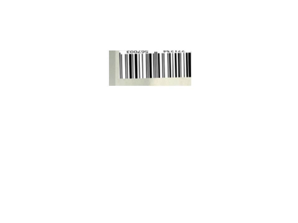
I had a huge choices on what bar-codes i was going to use. I wanted to keep it the same as what normal magazines have which was a smaller bar-code. I chose this to keep conventions the same. Most of the magazines i have looked at all had very small bar code and it was placed
mostly in a corner and sometimes tilted. I came
up with the one above as i felt it
it matched with other magazines and was
nice and small.
 As seen above, I have chosen the top right picture shot to go with my magazine. The top right is a Mid- long shot which I purposefully l used to allow the model to be seen from a bit of distance which allows her clothes to be seen and also her facial expression with her hair out in front of her face. This makes her appear more attractive to audiences espcecially male audiences. I used the angle of gaze to make it look like my model is looking at the audience which makes it look like she is looking at the audience which makes them want to buy it.
 Tuesday, 17 October 2017
This is my comparison between my final magazine front cover and my my flat plan.

Overall, there have been many changes throughout this process. Many things such as the colour of my font to match the green jacket worn by the model to make my feature colour stand out. I have taken out some graphics and kept one main circle graphic and made it the feature colour as well. The main feature stories have been moved to the right side to make space on the left for the graphic.
The name of the model is on her knee and it is in a very striking font to make it catchy for the reader and want to know more about the model who already looks very attractive which engages the audience more, specifically male audiences. The bar code has been moved from left to right and made smaller to match magazine conventions. The magazine is intended at youngsters and teenagers and the choices I have made I feel make it appropriate to call this a magazine a Hip-Hop magazine.


This is How used my brightness to level the brightness and darkness of my model and the background to make it look more appealing

With this tool My model was made more attractive so my audience feel the urge to want to pick up the magazine and purchase it. The model was made more brighter and the background darker which matched her trousers and made her stand out more. The face of the model looks very bright to catch the reader's eye.


Monday, 16 October 2017

This is my choice of Masthead. I found this style of font on a website called Dafont. I have used a style of font that is called Groovy as i feel this is what would suit my genre of a magazine which was HIP-HOP. The style makes it look close to a piece of art or graffiti which is mostly done by teenagers which is who my main target audience are. Furthermore, I have used A Green colour because of the fact that that my model is wearing a green jacket which made my feature colour green so it all matches with everything. which interacts with the reader and stands out in his eyes. It seemed to be apt to me as it matches with the genre of my magazine and also the target audience. The co lour green gives the reader thugs and hooliganism danger which is perfect for the genre of my magazine.

Monday, 9 October 2017

Thursday, 5 October 2017

Wednesday, 4 October 2017


I have produced a flat plan of my magazine.
I have made the Masthead red purely due to the fact that it seemed a convention of other similar magazines such as vibe.
I put my cover feature stories on the left and right and made sure to give clues as to the type of genre of the magazine which i also noticed with other music magazines.
I put my bar-code to the left which was where it was placed in most of the other magazines looked at.
There were many graphics used in the Vibe magazine so i went and included a graphic as seen in my flat plan. I have put two graphics.
I made use of Puff words which help to increase the status of my magazine. Words such as Exclusive.
I put a little teaser at the bottom such as "Up Your Game". This is very common in music and sport magazines to entice the reader to read the magazine.
My background colour will white and my main colour will be red but my model will most likely wear black as it suits the Hip-Hop theme.
My Reader Profile:
There are many questions to be answered when it comes to the audience of my magazine.
Who is my magazine targeted at?
Age:
My magazine will be mainly targeting an audience of the ages of 10-24. It will not be lower than ten due to the fact that there may be some graphical and inappropriate content. My audience are people who like the genre hip-hop and listen to famous artists such as Drake, Eminem, Bruno Mars and others.
The hobbies of my audience:
My magazine is not specific to any people who like different hobbies but it is mainly for people who do like playing sport as they listen to such music when playing. Furthermore, I want to bring news and gossip about every famous artist for my audience so for that to happen i need an audience who care very much about these sort of stuff and have a sort of addiction towards this kind of music. I am aiming at people who are slightly crazy and risk-takers. Their weekends are not spent on doing homework but rather going to parties and concerts. People who have headphone out their ears only when sleeping.
Job Description:
My magazine is mostly targeted to lower working class people as it will be very informal and there will be a frequent use of colloquial language which is not a type of magazine a working class person will want to buy. My magazine will be aimed at young teenagers and students who listen and dedicate a lot of their time trying to get hip-hop music to listen to and also are very keen on grime artists listed above.
Gender:
Looking at other hip-hop Magazines such as Vibe, I came to the conclusion that most of the models are people who are male which is something I am going to slightly change by having a female model on the front cover to be able to reach out to a wider audience range and more particularly females.
Income:
I am not aiming at anyone that is working specifically. My magazine will not be a very astronomic price where customers will have to skip times to save up. my magazine will be suitably priced so that teenagers who mostly are not working as of yet can afford to purchase each edition.


Tuesday, 3 October 2017

To gain a better understanding of the conventions of magazines, i have deconstructed a magazine. I chose a music magazine as it is what I will be creating for my preliminary , I chose a vibe magazine as it is a hip-hop magazine which is what i am doing. This will assissist me tjroughtouth this process of my preliminery task as I will be able to pick out key things that have to be on my magazine especially the music ones. The one choses above is A vibe magazine with famous rapper T.I on the front cover. The shot type is a mid-close up which is something I must take into consideration when producing my magazine. Even the masthead speaks A lot for itself as it has a vibrant red colour which is something common in many music magazines. I will definitly be looking for ideas on pull quotes as music magazines tend to always include them which is a huge convention.
My Initial Ideas:


The name of my magazine is Beat. I have chosen this as i feel that it strongly links to Hip-Hop and gives connotations of grime. I have looked at Hip-Hop magazines such as Vibe who have all their magazines very similar to each one with very slight difference. The main thing about this magazine is the model. The model is mostly a male in each edition. The model always looks angry or a very
startled face. Personally I am looking to take a mid-close up shot of my model as I do want to keep similar conventions to magazine such as Vibe.
In terms of colour, i will keep my background white but will use the colour red with my model wearing black.
I was initially quite worried as I have never used things such as Photoshop however now I am a bit more confident and with the right support i can get my magazine up and running.
Monday, 2 October 2017
Colour Theory: What is expected.
When we see colour on something, whether it is for a movie or a magazine, the one thing we do not say is that it was chosen to look nice. All colours used are there for a purpose and that colour used tells you a lot more information than you think. When a director makes a person or character wear a certain colour, he does it to convey meaning, thoughts and feelings to give the audience some more information on that character.
Below our some colours and their connotations based on a colour theory:
White: Represents purity, innocence, angel, cleanliness.
Red: Represents Danger, love, passion and can also mean something is important.
Pink: Can Represent a feminine side, if a magazine has a lot of pink, it is most likely targeted at female audiences.
Grey: A very neutral colour usually used to offset other colours.
Black: Show something is professional, can also show connotations of power.
Purple: Can represent Royalty and luxury as in the olden times, only wealthy people were allowed to wear purple.
Orange: Can represent the autumn season and also can represent food.
Brown: A very earthly colour, A colour to promote security.
Yellow: A positive colour. Warm (Summer), Can mean hazard.
Green: This colour normally is linked to the environment, recycling and trees and conservation.
Blue: Can show peace, sky, Health.
Sunday, 1 October 2017

Conventions of a Magazine:
1) Masthead: The title of magazine
2) Model
3) Anchor: The link between the photo and the text
4) Barcode
5) Angle of gaze: the model looks at reader to make him want to pick it up.
6) main features cover story
7) puff words: words used to increase the status of a magazine
8) feature colour + white or black to compliment
9) pull quote: A quote from inside to pull you into the magazine
10) graphic: A box or any shape with additional information
11) house-style: A companies preferred lay-out.
Subscribe to:
Posts (Atom)